Issue 5: Black + White
Letter From the Creative Director
January 19, 2020
From the pages of Issue 5: Black + White
By Lauren Bello Okerman | @folklaurstudio
One of the first things you learn when you are learning to make your own marks is to make a black line. The only reason you see this mark is because your line of graphite or ink or crayon is on light paper. At first, all of your lines are black lines; your marks are made with singular purpose. As time moves on, and you play with shapes, you also play with pressure. You notice that you can still see your mark if you press only slightly, and you realize that you can make an infinite amount of tones if you allow yourself to. Your mark-making becomes both more complex and more subtle. The more you begin to explore the range between the black mark and white paper, your art more accurately reflects your detailed intention, and thus yourself.
For artists, the name for this play of dark and light is called chiaroscuro. Chiaroscuro is an Italian word and technical term for the interplay of black and white to create volume and drama. It’s what we might call contrast in familiar terms, but the full definition is much more than that. To employ chiaroscuro is to use very little of pure black or white, but to actually master the range of tones in between––the gray area.
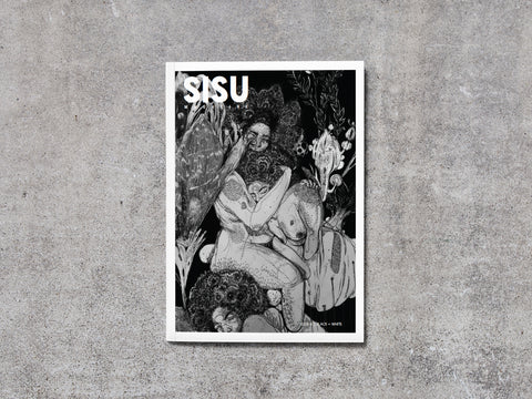
In the artwork of Wyeth Moss in this issue, you will notice the limited palette of their drawings. It’s what you might call black and white. When you examine more closely, the detail and power in their work is actually a product of the gray tones. Their drawings may not appear to have color, but they are not bi-tonal––they are made up of infinite grays, stipples, dots, lines, smudges. In fact, the black and white they use is to highlight and bring forth the infinite tones of gray that are actually their “colors.” Wyeth is a master of chiaroscuro. Even now as they transition to using color in their new and future work, they know and harness the power that resides in the range of tones between the extremes. The things these drawings make you feel—depth, beauty, complexity—are not the result of the black or the white, but a product of mixing the two with skill and intention and creating a landscape of the shades between.
For Issue 5 of our Sisu Magazine, which we have themed Black & White, we are really intending to highlight everything in between. As in chiaroscuro, the concept of Black & White bookend the power of the infinite in-between zone, where nothing is all or nothing, and everything is somewhere on a continuum. This issue explores how humans, situations, perceptions, and places are born, exist, and thrive between finites and absolutes.
As art presents a corollary to life, this is our human condition. As you read this issue of Sisu Magazine, I invite you to acknowledge the power of the gray, reject the canon of the binary, and embrace the delicate and exalted freedom of subtle shades of existence.